From Dark Omen Wiki
Stub for detailing what WARTBED's GUI can and do look like.
Unit icons
Sources of inspiration for the WARTBED 'unit and regiments identification and usage interface.
The Total War games
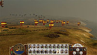
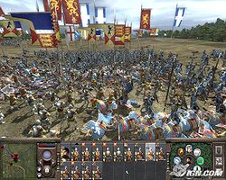
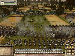
| Total War titles have a very conventional RTT interface design with all units being presented in a Poker or Domino hand layout: each unit has its card (or brick) and these are lined up at the bottom of the screen. These bricks contain additional information, like unit strength and ammo left.
 Empire: Total War battle interface |
The Card Hand interface
Advantages:
- At-a-glance overview of army status
- Fast identification of a particular unit
- Fast interface to work with when doing non-map interacting unit tasks
- Standard model and recognisable
Disadvantages:
- No positional information
- Slow interface when performing unit-to-map operations (mouse must always switch between map and unit list)
- Enemy units must be presented in a different format
- Arguably detracting from immersion
- Since its screen area is limited, it risk being cluttered, or requiring scrolling
- Will occupy greater screen real estate
|

| 
| 
|
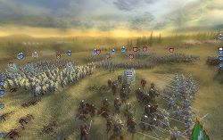
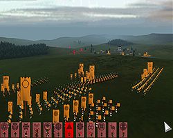
| Shogun: Total War GUI
| Medieval II: Total War GUI
Also notice radial action interface similar to Dark Omen's down to relative icon positioning. Coincidence?
| Empire: Total War
Card hand GUI failure from icon overcrowding
|
Dark Omen
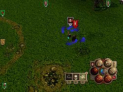
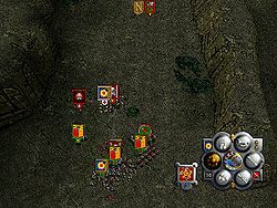
| In Dark Omen the user interface is minimal with units being represented and identified by their regimental banners. The banners have two purposes: on the one hand they're hiding the UI buttons by letting them masquerading as regimental banners, thus increasing immersion. Secondly, they are regimental-specific dashboards acting as container for additional information.
The Dark Omen banners also includes information about
- Unit type (the banner bitmap, indicating both faction and type but in a heraldic way, requiring player memorisation of unit banners)
- Unique unit ID when multiple units use the same banner (a number indicating which of the type)
- Affiliation (indicated by the banner border colour)
- Orientation (an arrow beneath the banner itself)
- Visibility to the enemy (white arrow == visible; green == invisible)
- Routed (the arrow is yellow)
- Fleeing (a superimposed white flag)
|
The Banner interface
Advantages:
- Naturally indicates the unit's position
- Friends and foes are presented with the same interface
- Blends for increased immersion with a tactical setting, especially for pre-modern warfare games.
- Requires less screen real estate
- Arguable quick to work with for unit-map interactions since mouse does not have to be constantly moved to and from a unit icon area.
Disadvantages:
- Arguably slow to work due to
- requiring more mouse movements (mouse must potentially move all over the screen to select units, especially when multi-selecting)
- requiring re-acquisition of unit icon before interaction (since they move with the unit and map)
- More restrictive a container for incorporating additional status information
- If icons are allowed to overlap they may clutter. If they are kept apart they may be disassociated with their unit. (Note that icons aligned to the screen edge should never be allowed to overlap.)
- High-speed units' icons may move fast enough to be difficult to click.
|

| 
| 
|
Dark Omen
Notice spread of unit icons
| Dark Omen
Icons not at the edges are allowed to overlap
| XIII Century
Note that this recent game uses the same basic interface as Dark Omen
|
WARTBED
There are several motivations for using either style of interface. One is for fidelity with the original game when designing a module. Another is that the interfaces may be argued to lend better or worse to different types of games; f.i a banner interface can be argued better for a terrain RTT while a card hand interface is better for a space game. And a third argument is simply personal preferences. The ultimate would be if both these styles were supported and selectable both as a module setting and as a user preference.
Ideals
- Status and identity information
- Immersion
- Less occupied screen space
|
| Problems
- Status indicator crowding
- Integrated information requires assets
- Flighty icons are hard to catch
- Trapped icons may be disassociated from their unit
|
Solutions
| Status indicator crowding: too many information widgets (f.i. health, morale and ammo metres) may create a cluttered interface. This can be avoided by interleaving information or naturally integrating information.
|
| Icon flashing: extra information can be conveyed (morale, under fire, etc) if the banner unit ID icon is interleaved (flashed) by status icons, similar to blinking warning lights. The advantage is that more information can be packed into a small icon. The drawbacks are that this model may lend to information overload and bad player stress when too much starts flashing at once, and that some waiting may be required to obtain all or certain information.
|
| Integrated information: to alleviate icon cluttering or distracting flashing information can be integrated naturally into the icon, for instance a banner tattered with low unit health, or an arrow lowered on the pole with morale. Though arguable contributing to immersion, this also requires additional assets to be produced.
|
| Cameos: Dark Omen combined these of sorts in that some events triggered unit leaders to report their status in person ("we're under fire!"), and their appearance reflected their status (health).
|
| Banner interfaces, as in Dark Omen, minimise screen space occupied while providing additional (positional) information the card hand interface cannot, but creates a cascade unique issues requires specific interface accommodations:
|
| ⇓
|
| Icon trapping: when using a banner interface, the icons of rapidly moving units may be difficult to click, mush more to multi-click. This can be addressed by freezing the position of any icon the mouse if hovering over.
|
| ⇓
|
| Icon disassociation: a locked (trapped) icon may be left far from its unit. This can be avoided by permanently or temporarily focusing the camera on the unit to which the icon is attached.
|
| ⇓
|
| Disjunct focus I: With temporary focusing of the camera on the unit associated with the icon hovered over, that unit will be in the centre of the screen while the icon will remain locked at the original position. Thus, the icon and the cursor must also be shifted toward the centre.
|
| ⇓
|
| Widget wrenching: When the icon starts to move the user will feel the interface as unstable and counter-reactive to his input. Therefore a timeout interval before shifting starts is necessary.
|
| ⇓
|
| Careening cursor: shifting of the cursor (and also icon) will unavoidably lead to a user sensation of the interface having a will of its own. This cannot be avoided, only mitigated, for instance by accelerating the shift by a double asymptote curve.
|
| ∴
|
| Tried; conclusions: Trapping-focusing-shifting works, even works well, but the icon and cursor shifting if unconventional, unexpected and (initially) disconcerting.
|
|
| Off-center focus: If the camera is centre-focused on the icon's unit the icon and unit may be disjunct. By focusing the camera off-centre that unit can be brought to the icon. This is mathematically somewhat involved but avoids the Disjunct focus I issue cascade.
|
|
| Disjunct focus II: Alternative solution not involving shifting the icon and cursor; connect the icon with the unit through an indicator line or something.
|
|
