Wartbed:User interface
From Dark Omen Wiki
(→Unit icons: +disadv for banner interface) |
(→The Total War games) |
||
| Line 17: | Line 17: | ||
* At-a-glance overview of army status | * At-a-glance overview of army status | ||
* Fast identification of a particular unit | * Fast identification of a particular unit | ||
| - | * Fast interface to work with | + | * Fast interface to work with when doing non-map interacting unit tasks |
* Standard model and recognisable | * Standard model and recognisable | ||
</div> | </div> | ||
<div style="padding:1em; background:rgb(225,215,210);">'''Disadvantages:''' | <div style="padding:1em; background:rgb(225,215,210);">'''Disadvantages:''' | ||
| - | * No positional information | + | * <span style="color:red">No positional information</span> |
| + | * <span style="color:red">Slow interface when performing unit-to-map operations (mouse must always switch between map and unit list)</span> | ||
* Enemy units must be presented in a different format | * Enemy units must be presented in a different format | ||
* Arguably detracting from immersion | * Arguably detracting from immersion | ||
| + | * Limited screen space: risk of clutter or requiring scrolling | ||
</div> | </div> | ||
</div> | </div> | ||
Revision as of 19:38, 27 April 2009
Stub for detailing what WARTBED's GUI can and do look like.
Contents |
Unit icons
Sources of inspiration for the WARTBED 'unit and regiments identification and usage interface.
The Total War games
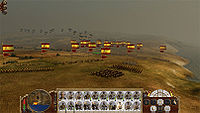
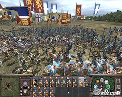
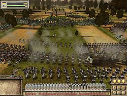
| Total War titles have a very conventional RTT interface design with all units being presented in a Poker or Domino hand layout: each unit has its card (or brick) and these are lined up at the bottom of the screen. These bricks contain additional information, like unit strength and ammo left.
| The Card Hand interface Advantages:
Disadvantages:
|
Dark Omen
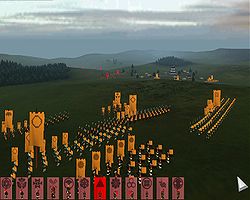
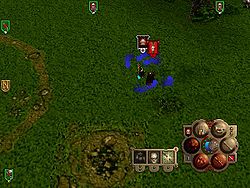
| In Dark Omen the user interface is minimal with units being represented and identified by their regimental banners. The banners have two purposes: on the one hand they're hiding the UI buttons by letting them masquerading as regimental banners, thus increasing immersion. Secondly, they are regimental-specific dashboards acting as container for additional information.
The Dark Omen banners also includes information about
| The Banner interface Advantages:
Disadvantages:
|
| |
| Dark Omen Notice spread of unit icons | Dark Omen Icons not at the edges are allowed to overlap |
WARTBED
There are several motivations for using either style of interface. One is for fidelity with the original game when designing a module. Another is that the interfaces may be argued to lend better or worse to different types of games; f.i a banner interface can be argued better for a terrain RTT while a card hand interface is better for a space game. And a third argument is simply personal preferences. The ultimate would be if both these styles were supported and selectable both as a module setting and as a user preference.
